")
Welcome, Trainers! It’s time to embark on another journey into the wonderful world of Box Art Brawl.
Before we head out, however, let’s visit the lab and recap what happened last week. It was the DS’ River King: Mystic Valley that we put under the microscope and, surprising nobody, the awful European variant came dead last. Things were pretty close up the top, though, with North America taking 46% of the vote and Japan claiming 41%. Well played, NA!
After a healthy dose of Pokémon content this week, we thought it was only right to keep the creature catching going. This time, we’re looking at Pokémon Trading Card Game for the Game Boy Color. Originally released in 1998, this RPG swapped the video games’ usual turn-based battling for the rules of the card game — and, for the TCG fans out there, it works really rather well!
There are just two covers to choose between this week, with the North American and European designs facing off against Japan. Let’s catch ’em both!
Be sure to cast your votes in the poll below; but first, let’s check out the box art designs themselves.
North America / Europe
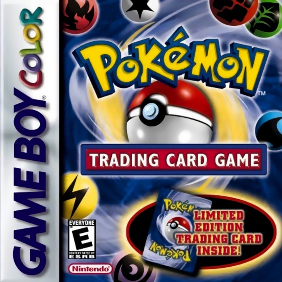
Now this is a classic, no? Sure, a lot of the design is taken up by that promise of the limited edition card inside, but if you’ve ever looked at the back of a Pokémon card, that central Poké Ball is an iconic. The design mirrors the card back pretty faithfully (the ball opening upside down and all), and we like the small energy icons thrown in there for good measure.
Japan
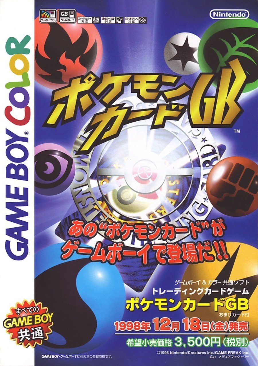
The Japanese design is a lot… uhh… shinier. Rather than mimicking the back of a trading card, this variant has an actual card on it, boasting the cool off-white Poké Ball design that used to adorn the rear of Japanese trading cards. The energy symbols are a lot more prominent in this one, though we’re not quite sure why there’s a giant shining ‘Pocket Monsters Trading Card Game’ symbol in the middle. It kinda feels like it dominates the composition a little, no?
Thanks for voting! We’ll see you next time for another round of Box Art Brawl.